Advantages for Data Stakeholders
Simplify Complexity
Most datasets exceed 4 columns, yet plots are limited to X vs. Y, size vs. color axes. Going well beyond 3D, the patented Dimensional Engine™ enables you to see up to 18 dimensions per data point. It’s achieved by layering numerous special effects onto each data point, where intensity of each effect shows an added numeric dimension.
This expanded perspective improves the odds by up to 3,060x that you’re looking at the right factors in the right combinations at the right time for greater insight. It’s also powerful for Data Storytelling by helping your audience understand more, faster. Try an interactive online demo here.
Understand 3x More Data
Independent research shows how immersive technologies enable you to absorb 3 times as many data points as you presently can using flat screen technology. This is accomplished with Immersion Analytics’ support for leading Virtual and Augmented Reality headsets. As a result, you gain faster interpretation of data charts and make more completely informed decisions.
Collaborate Virtually in Realtime
Join your colleagues (and enterprise applications) in a shared immersive experience, from any supported hardware. Immersion Analytics has pioneered the industry’s first multiuser collaboration platform uniquely suited to larger datasets.
Communicate with Impact
Share compelling data stories and expand data literacy. Immersive visualizations enable your audience to see your data from all sides and make obvious any hidden relationships.
Nothing commands audience attention quite like a VR headset. Beyond engaging, they literally prevent your audience from looking at their smartphones while you talk.
Simplify & reveal complex topics gently using Stepwise Storytelling™ — layering dimensions one at a time along your narrative arc.
Use With Existing Tools & Workflows
Preserve and leverage investments you’ve already made by using our integrations with existing Business Intelligence (BI) and data science tools. Connect it with Tableau or Qlik Sense, feed it with data from Google Sheets or CSV, or incorporate it into existing Python or MATLAB scripts.
If you’re a software vendor or enterprise IT stakeholder, learn about the Immersion Analytics Runtime for innovating custom integrations & workflows. Contact us, we’re happy to help!
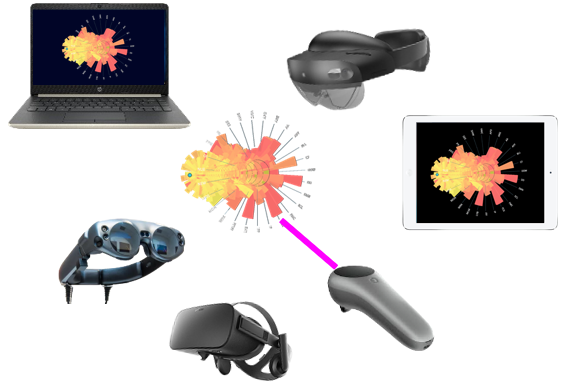
Work with Leading Devices
Immersion Analytics supports PC, Mac, iOS, and leading smart screens, VR & AR headsets including Oculus, Magic Leap and HoloLens 2. We’ve optimized our technology to fully utilize modern GPUs — you can even see more dimensions using your iPhone.
Record and Share Video Presentations
Share new insight by recording video you can publish or share privately with stakeholders and collaborators. Record animated .gif files you can even embed in PowerPoint presentations.
Reproduce Immersive Experiences
Reproduce completely immersive experiences by sharing the Immersion Analytics document, a simple file you can email for colleagues to load into Visualizer at their convenience and on their preferred device.
Examples
Cybersecurity
Maintaining situational awareness of networks at scale is key to heading off cyber attacks. Using Immersion Analytics, cybersecurity researchers and SOC specialists monitor numerous dimensions & interactions on their assets, network and logs in realtime.
Much like financial markets, cybersecurity is a nonstationary problem. Said differently, the very nature of the attack vector keeps changing — as a product of human ingenuity. This is why AI and machine learning approaches, while helpful, offer incomplete protection: the human analyst is key to noticing what’s new.
Multiple Stock Charts
DataTubes™ enable you to visualize and compare numerous data series. This visualization type combines the best of a heat map and timeseries plots in one.
In this example, you’re seeing all stocks in the Materials and Utilities sectors of the S&P 500. Like any Immersion Analytics visualization type, these can be animated over time and even fed with live data.
Loan Portfolio Management
This multidimensional scatterplot tells the data story of Fannie Mae’s loan portfolio. The green part is animated to shows fluctuations over 18 years. The red dots are static and show a 2008 financial crisis baseline.
Data Science
Surface plots are great for demonstrating the influence of multiple variables over one dependent variable. With Immersion Analytics Visualizer, you can show more dimensions on one chart by adding opacity and other effects.
Anomaly Detection
The Immersion Analytics Dimensional Engine transforms this chart by conveying additional attributes around each bar. The shimmering effect you notice on two middle bars imparts an anomaly meriting further investigation. It likely would have been missed using traditional charts because you’d be looking at fewer dimensions.
Artificial Neural Networks
This chart visualizes a neural network trained using Google Tensorflow.
Edge colors show weightings of the signals transmitted from one node in the network to another. These can be animated over time for each training epoch, demonstrating the flow inside the machine learning process.
For more inspiration, check out the Solutions Menu above.